Voluntary Benefits Data Revolution
METLIFE
MY ROLE
I owned experience design for key areas of MetLife’s voluntary benefits digital servicing digital transformation.
THE CHALLENGE
Revamp the digital experience for voluntary benefits by efficiently collecting and presenting extensive consumer data, including eligibility, enrollment, and recent activity, within a user-friendly design—in under 3 seconds.
ISSUES TO OVERCOME
Time to render full pages was unreasonably long due to multiple customer data repositories.
In an effort to satisfy undefined user needs, product teams often included more content than necessary – further increasing time to render pages, and decreasing customer satisfaction.
We would need to include content encouraging users to take advantage of products they subscribed to, without knowing at first load what users subscribed to.
THE SOLUTION
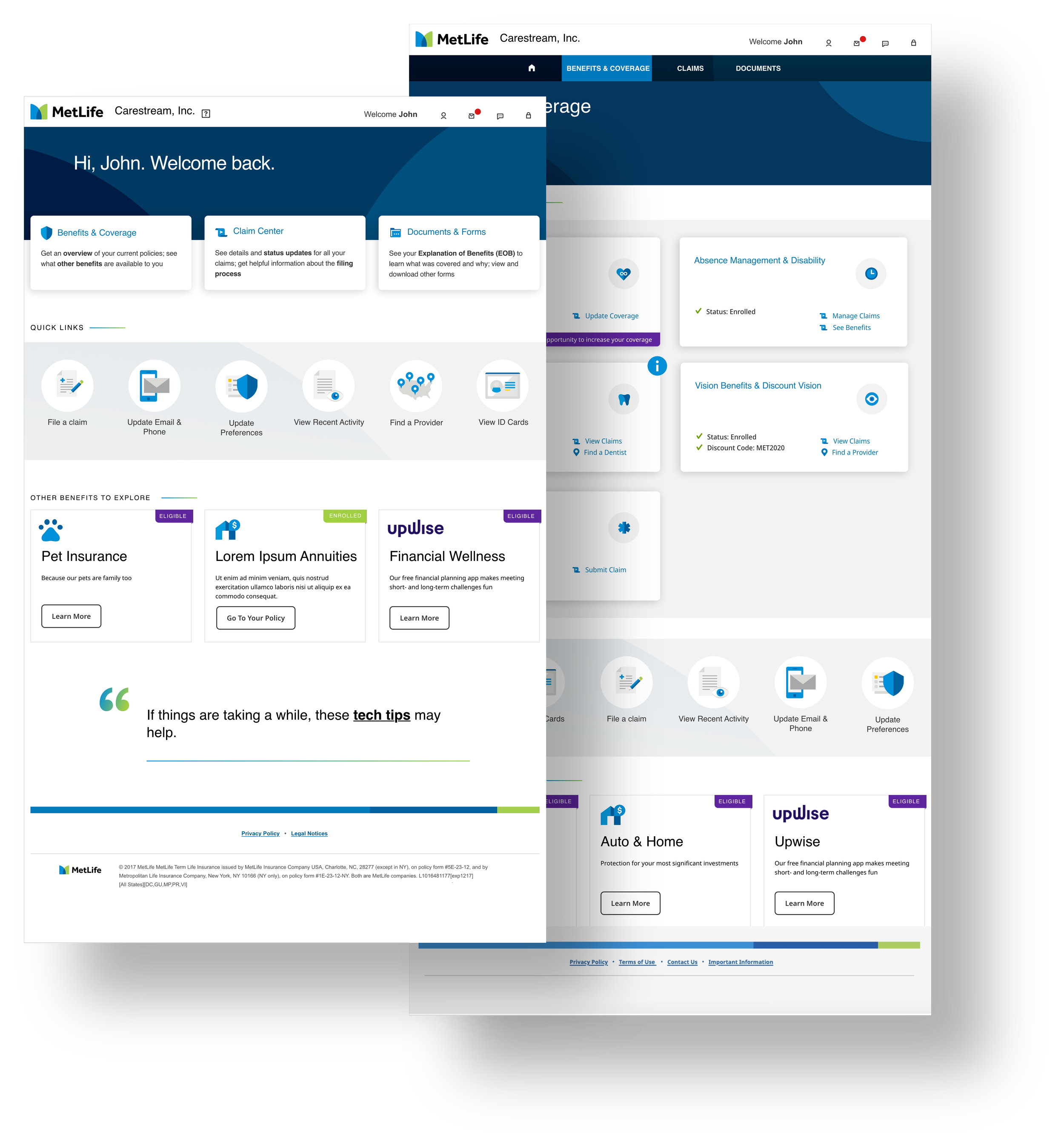
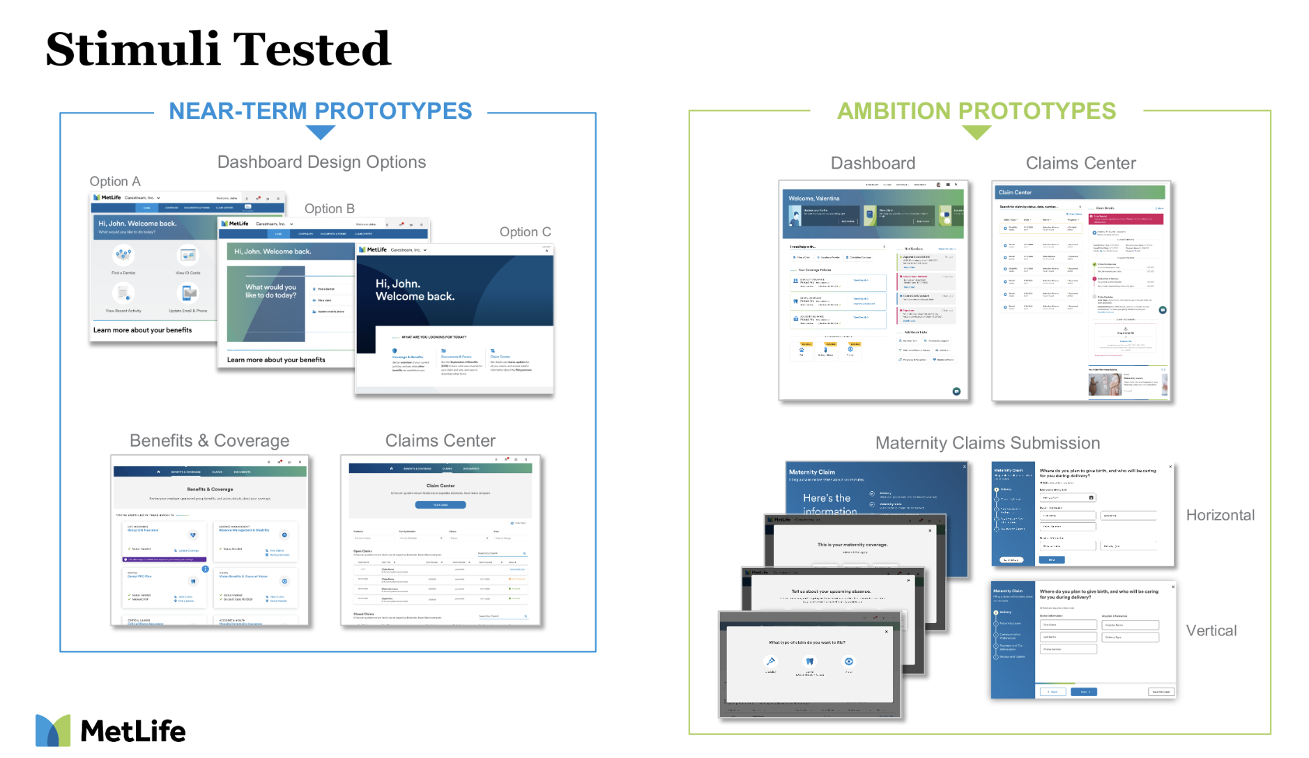
In addressing the distinctive challenges associated with a site housing critical yet infrequently accessed information, we adopted a user-centric approach by making informed assumptions about their motivations.
Recognizing the importance of recent account activity, we prioritized the visibility of such information, ensuring it took precedence for users as soon as users logged in.
To enhance the user experience, we implemented innovative design strategies to render pages dynamically. This not only maintained a sense of forward progression for users but also effectively concealed the background processes of complex databases at work. Our goal was to create a seamless and intuitive interface that not only provided instant access to critical data but also ensured users felt engaged and informed throughout their site experience.

User testing and iterative design allowed us to fine-tune creative solutions that would allow complex pages to be quickly rendered with member data from multiple databases.
The result is a site that not only holds essential information but does so with meticulously researched content strategy - allowing users to orient themselves in the servicing landscape and navigate to deeper levels of content or benefit data.

The
Process
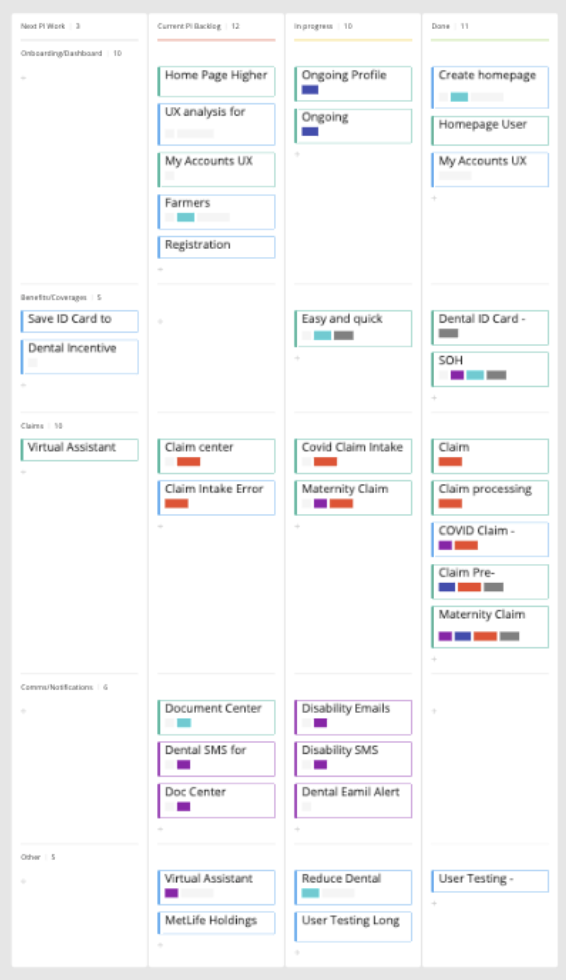
Sprint Planning
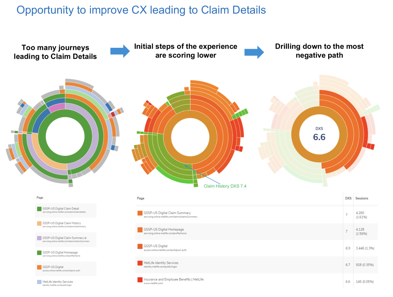
Analytics Analysis
Facilitated User Testing
Information Architecture
Content Strategy
Data Visualization
Iterative Design
Design & Technology Collaboration
Design System
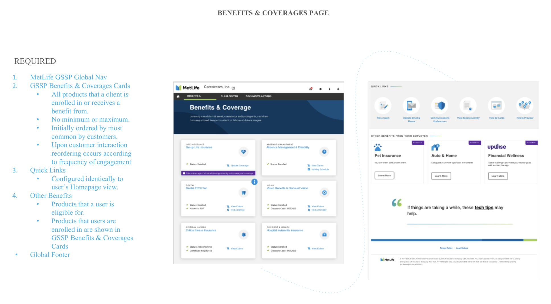
Each of four UX team members owned one of four specific business areas. I owned the landing and product experiences, as well as login and navigation.
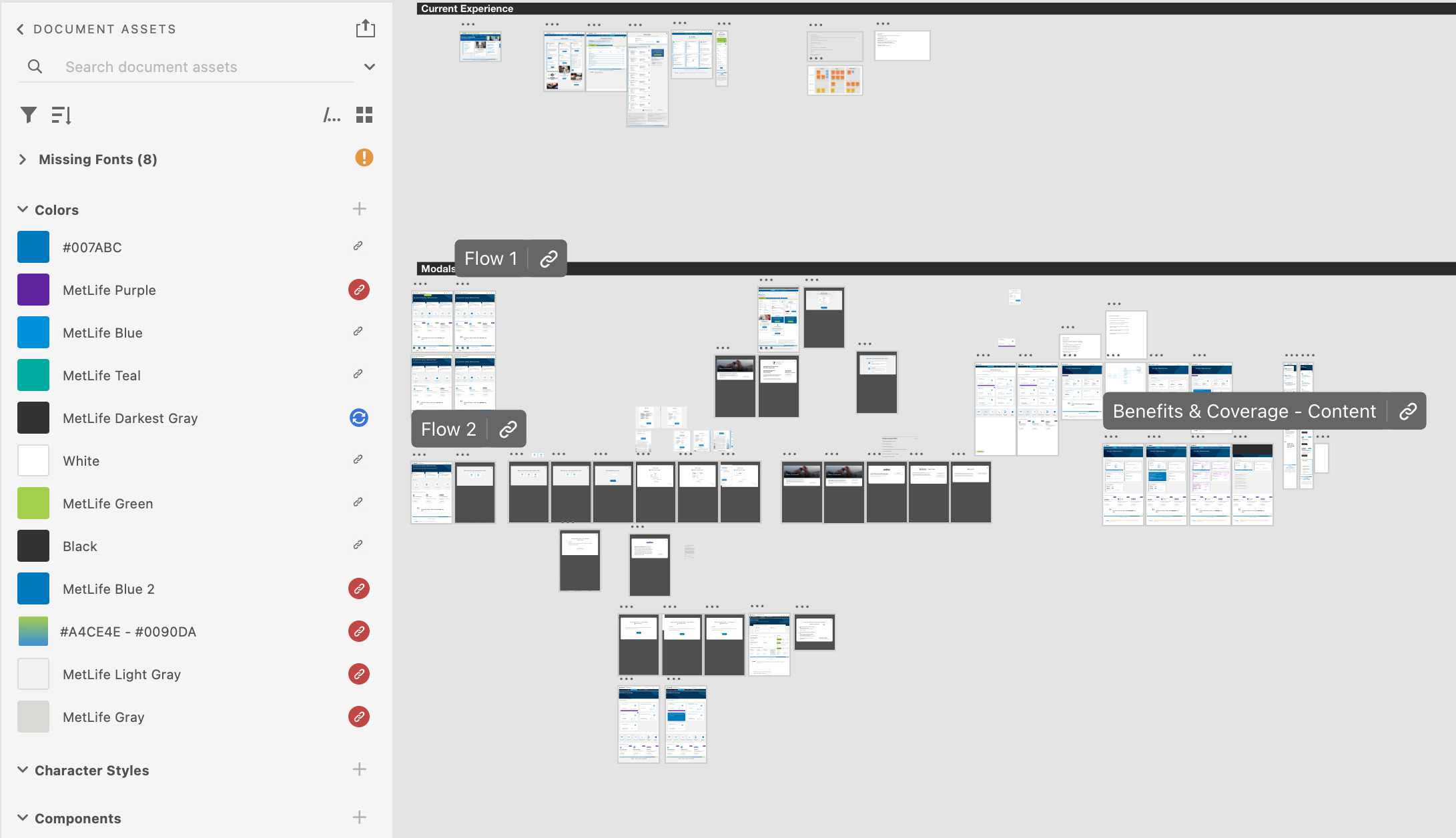
Four two-week sprint cycles were planned every nine weeks with each member of the UX team sizing projects in their own business area and detailing the project goals in Jira design tickets.
User data were explored deeply to understand behavior and the true source of friction.
Smaller components of a design project, in the case of this project - information architecture, content strategy, data visualization, and user testing - would be its own project taking one or more two-week sprint.
A concurrent content strategy included in-depth analysis of user analytics and product team interviews to determine business needs (display user-specific authenticated content that effectively informed users how to complete the task they’d come to complete).
I included multiple rounds of facilitated user testing, using detailed XD prototypes – first to discover whether we were including the right details in a much more limited content view, and then if the UX and UI was effective.
A foundational design system was available for marketing areas and preferred for servicing but components that were unique to servicing content were common.
Project completeness was dependent on Product team approval, and technology agreement prior to the end of each sprint.
Back to Work


H&R BLOCK
Online, mobile, and software app

METLIFE
Bite, snack, meal modals