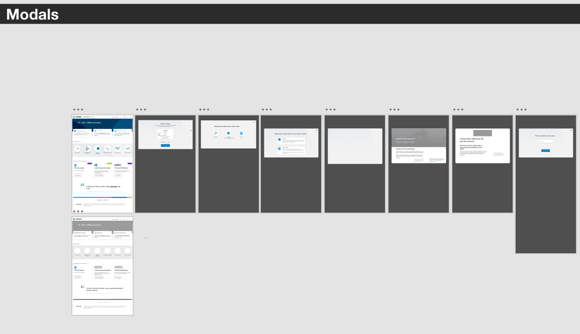
Bite, Snack, Meal Modals
METLIFE
MY ROLE
I owned experience design for key areas of MetLife’s voluntary benefits digital servicing experience.
THE CHALLENGE
Enable MetLife customers to effortlessly discover and explore their eligible benefits within the confines of their benefits account, eliminating the need for redirection to external pages.
Despite the abundance of web content typical for mature businesses like MetLife, the challenge lies in consolidating and presenting relevant information seamlessly for users.
Within MetLife’s servicing experience, we were committed to surfacing product content that would encourage members to receive the most value from their benefits.
ISSUES TO OVERCOME
Detailed product content was published on a separate marketing site.
Once authenticated on the servicing site, navigating to the marketing site would surface new navigation and provide no obvious path back to the logged-in path.
There was not a simpler solution available through MetLife’s CMS.
THE SOLUTION
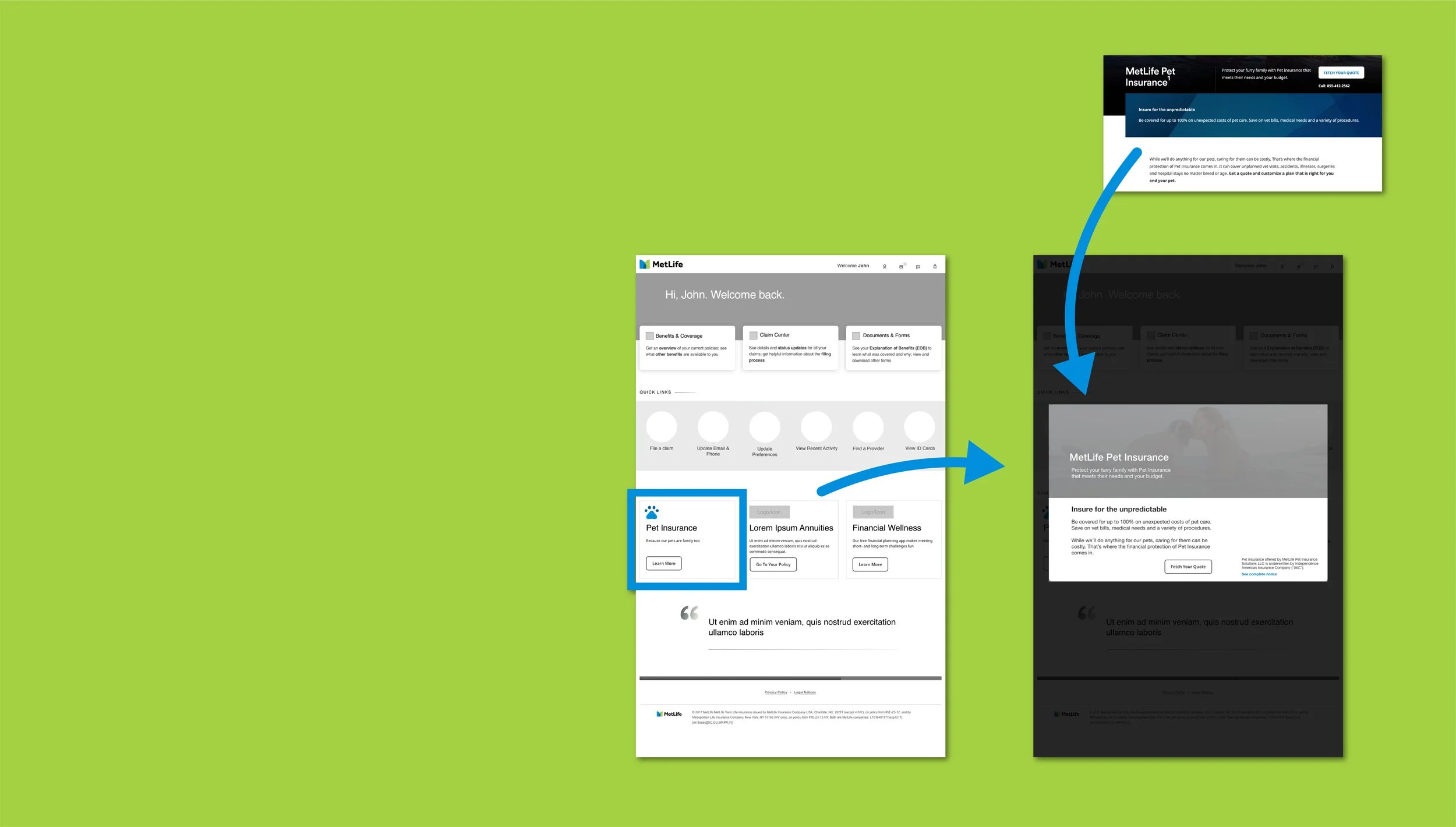
To enhance the user experience in the redesign of MetLife’s voluntary benefits homepage, our focus was on seamlessly introducing beneficial products like pet insurance within the user's logged-in journey. Mindful of the need for efficiency, I devised a tiered approach —
Bite, Snack, Meal
—wherein a concise overview of offerings is presented. Upon interaction, the system checks the customer's subscription status. If subscribed, we reinforce the product's value and provide avenues for management.
For non-subscribers, a modal window, drawn from the CMS, offers a snack-sized glimpse, allowing users to choose whether to delve into more information (meal) or continue their task.
This streamlined and replicable solution is currently in development, representing a strategic component of my work with MetLife.

The
Process
Sprint Planning
Analytics Analysis
Facilitated User Testing
Information Architecture
Content Strategy
Iterative Design
Design & Technology Collaboration
Design System
Each of four UX team members owned one of four specific business areas. I owned the landing and product experiences, as well as login and navigation.
Four two-week sprint cycles were planned every nine weeks with each member of the UX team sizing projects in their own business area and detailing the project goals in Jira design tickets.
Daily stand-ups reported progress and issues to product owners and technology teams.
Smaller components of a design project, in the case of this project - information architecture, content strategy, and user testing - would be its own project taking one or more two-week sprint.
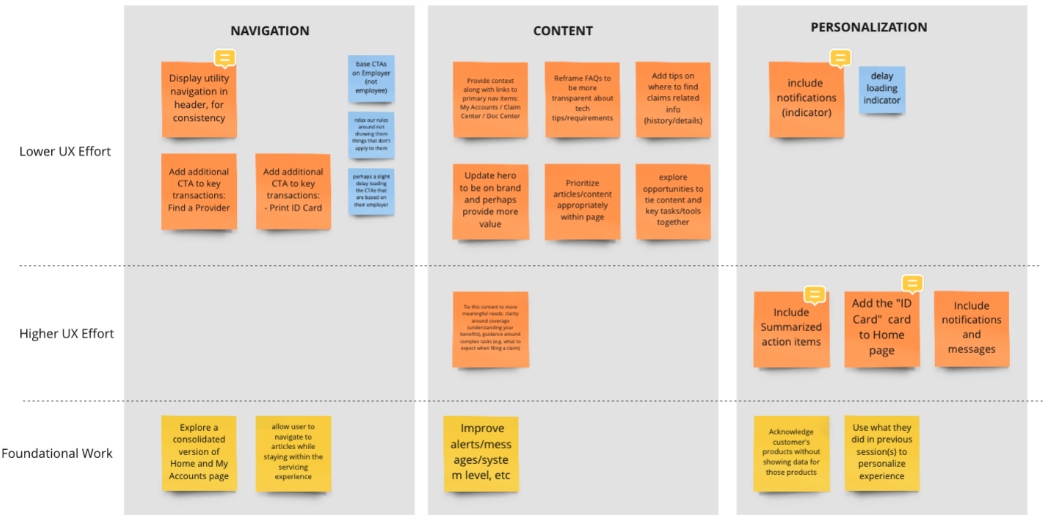
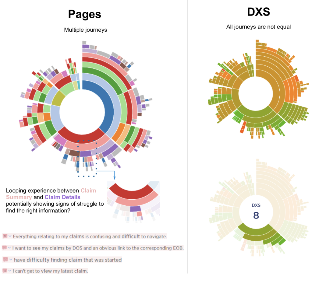
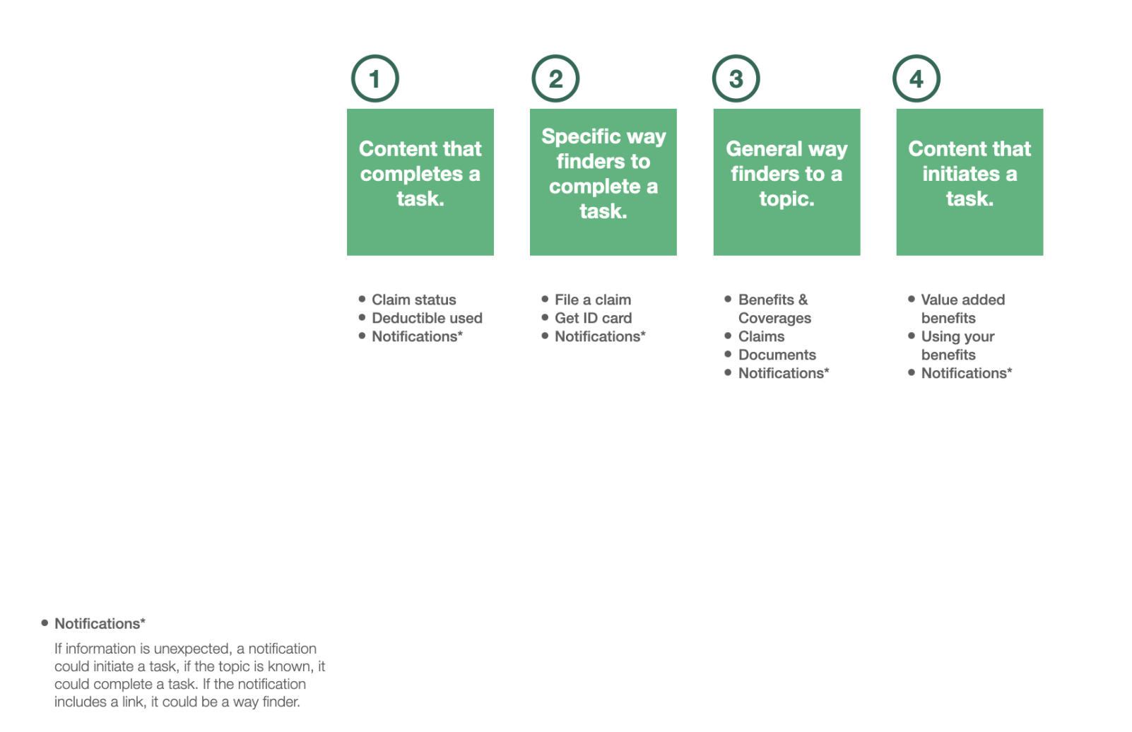
A concurrent content strategy included in-depth analysis of user analytics and product team interviews to determine business needs (surface adjacent products and services, and encourage subscribed service use).
The product servicing experience was owned by a Director on the Product team, with each possible product that could appear there (Dental, Life, Vision, Pet, etc) owned by an additional product team – collaboration and broad, general consensus was key.
A foundational design system was available for marketing areas and preferred for servicing but components that were unique to servicing content were common.
Project completeness was dependent on Product Team approval, and technology agreement prior to the end of each sprint.
Back to Work
METLIFE
Digital transformation for an iconic brand
LENDSHIP
Taking the risk out of loaning to friends

